My take on different types of Peerlist posts
This is my take on different type of post on Peerlist.
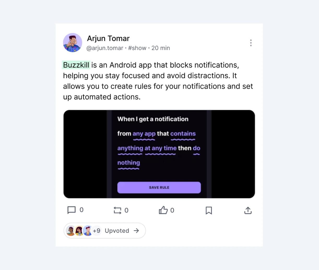
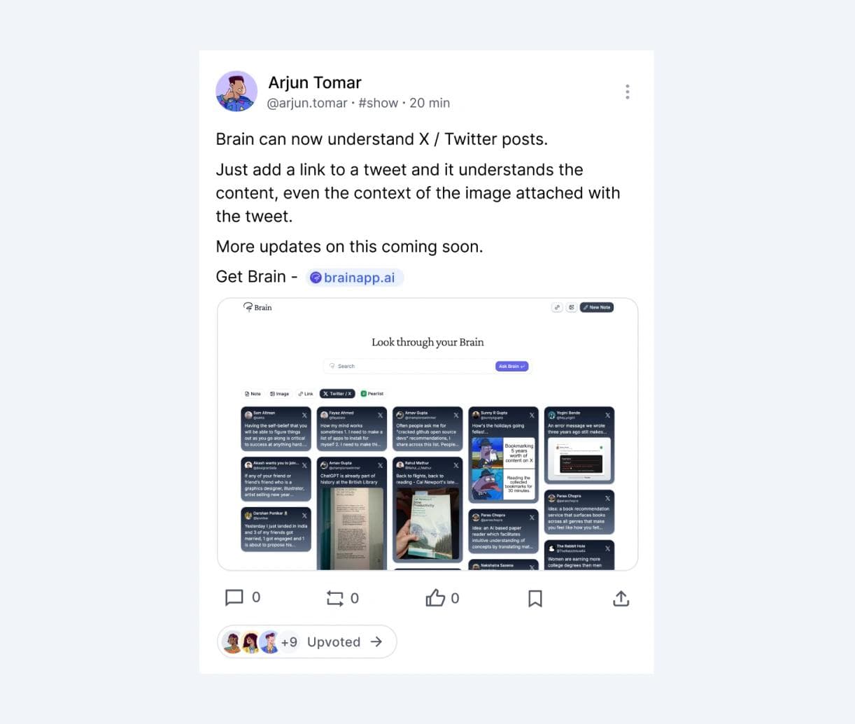
- Post with text and image: What is different here from current Peerlist layout is that I took away the space on the left side, as I mentioned in my last post. Besides that, you’ll notice the highlighted text, which I explained in point 5.
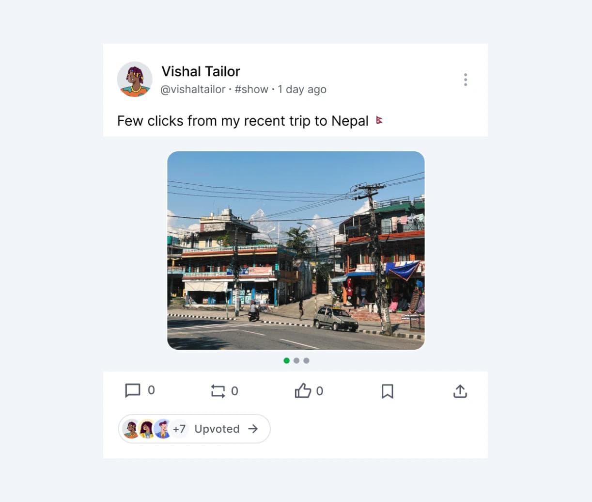
- Post with multiple images: I wanted to find a way to display images with various aspect ratios without cutting them off. So, I came up with this container that uses a carousel-style layout.
- Post having link and image: I wanted the link to really pop in the post, so I made it look like a badge. But I realize now that what I have designed is a too idea case since the link is at the end and not mixed in with the text or anything. My thought is that if the website you’re sharing has a favicon, it’ll show up before the link. If not, the usual browser icon will just take its place.
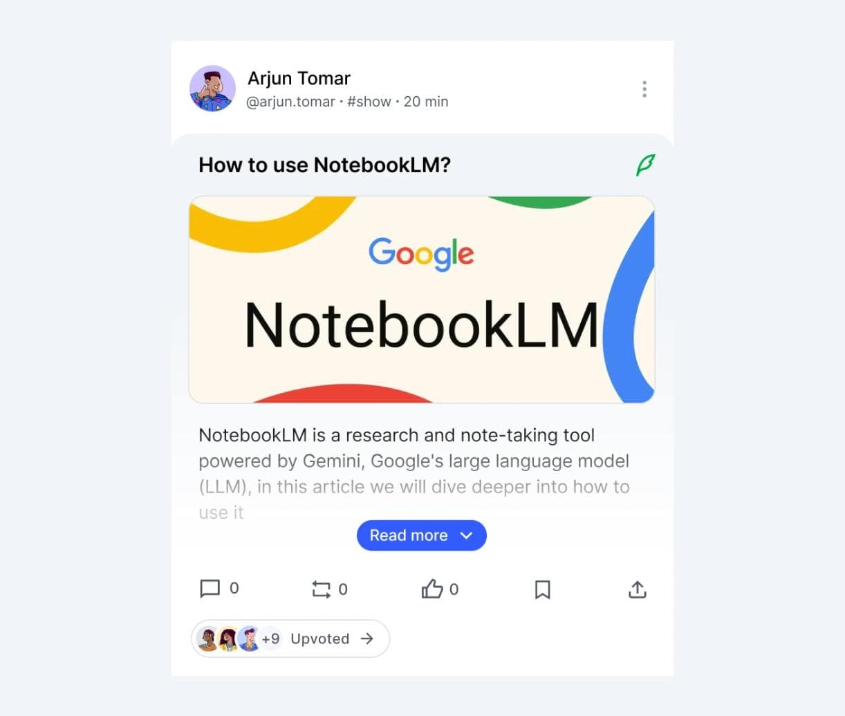
- Article as post: I wanted this to feel more like an in-app experience rather than just a link that takes you to another page. It should stand out from regular posts. When users click on "read more," it expands to give a full-page experience. So I come up with what you can see in image.
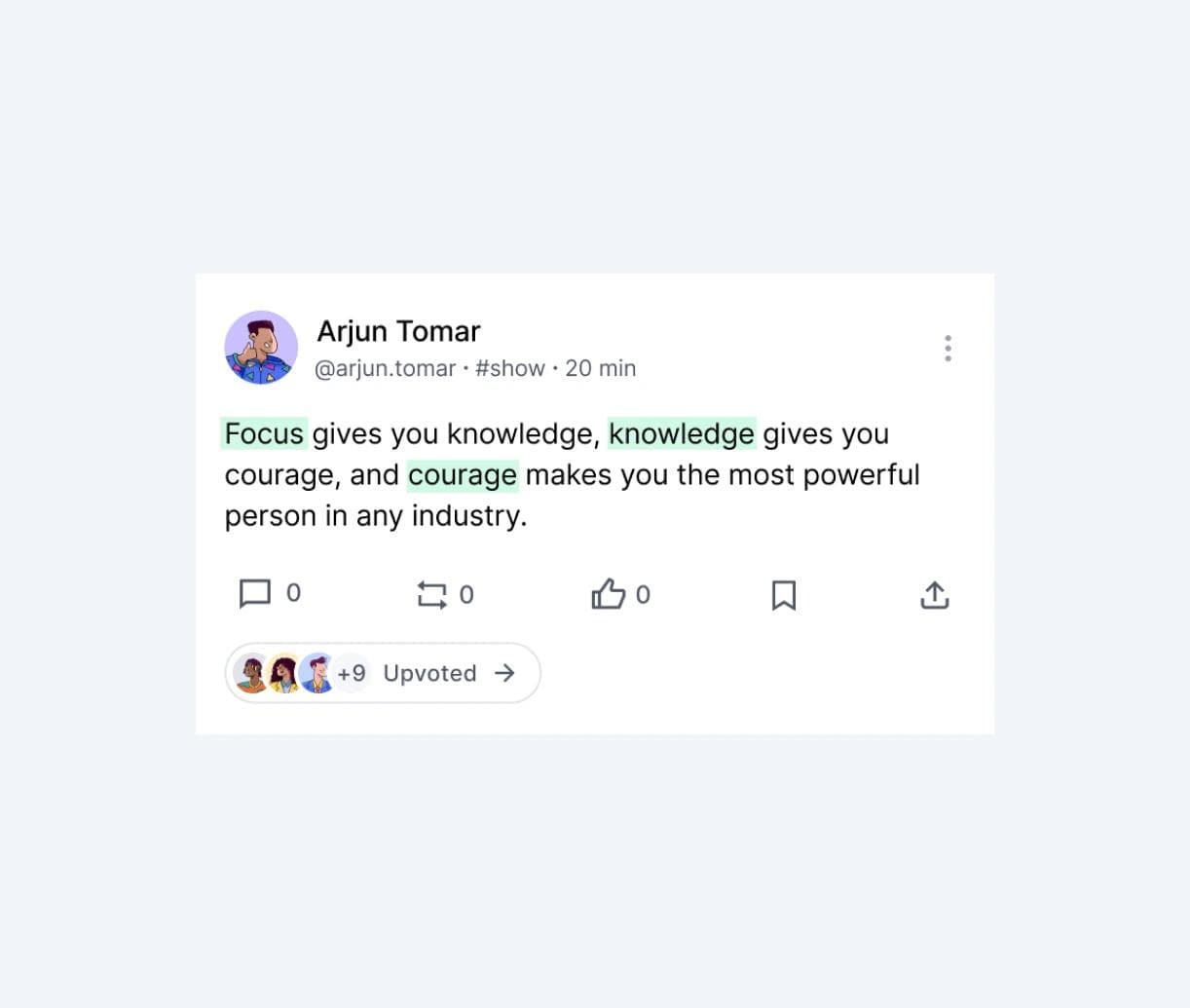
- Only text with highlights: When someone shares a post that's just text, it usually doesn't grab much attention. Only those who are really interested tend to read it. I wanted to give users the option to highlight certain parts of their text. While there's a chance this feature could be misused, I think users should be allowed to highlight about 4 or 5 words, or maybe even based on how long their text is. It could be interesting to use AI to determine if highlighting is actually necessary (I know, just brainstorming here, and I get that making it work could take some effort).
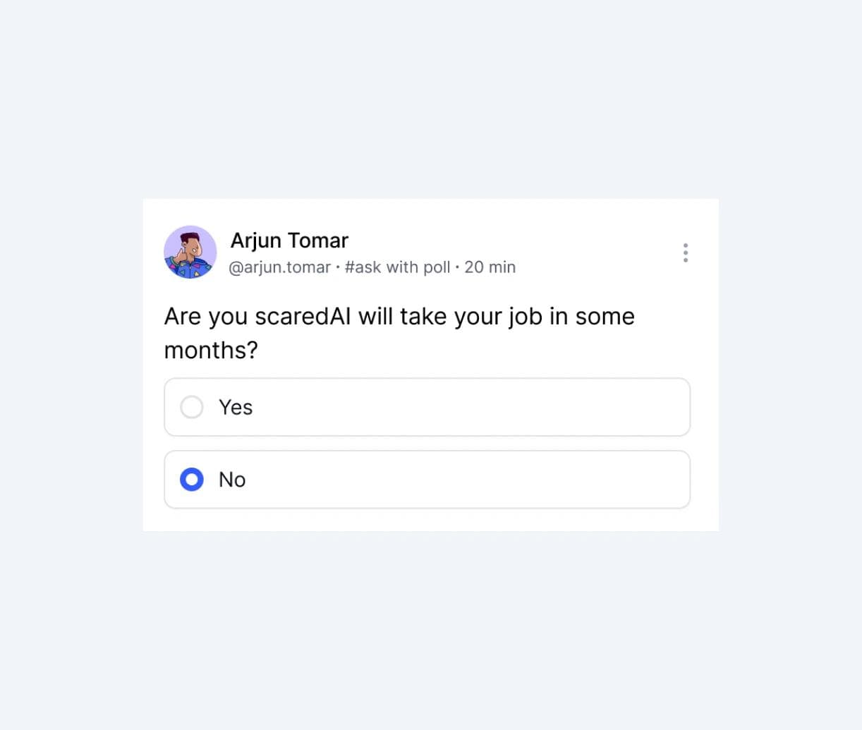
- Post with poll: This is just a different variation I preferred over current one.
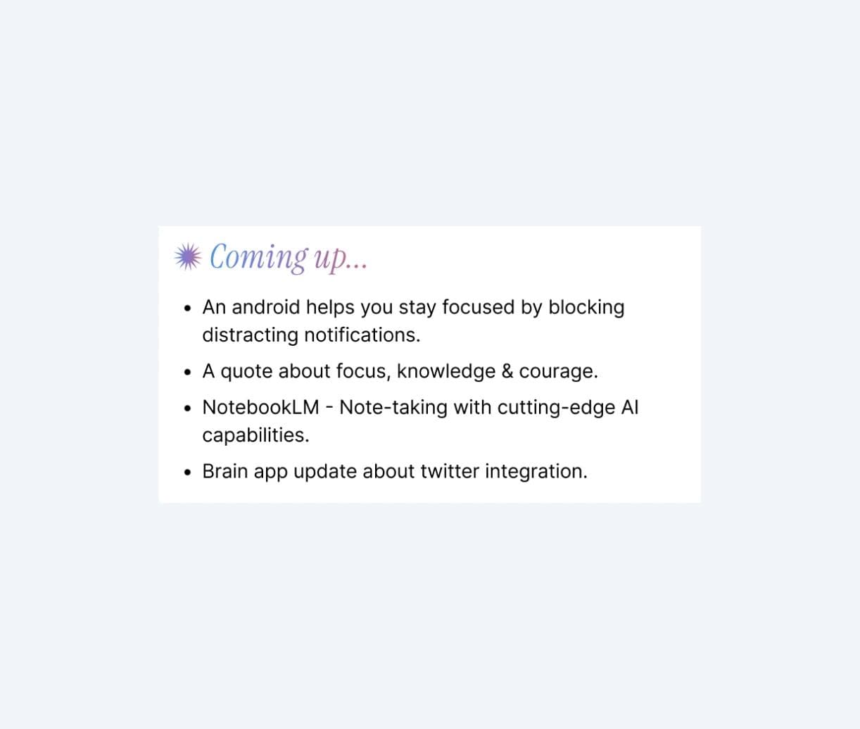
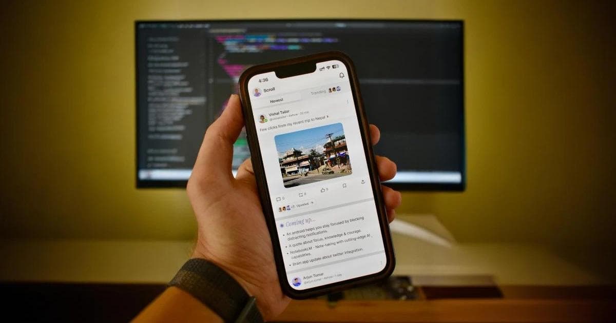
- AI Summary: I think this idea is pretty cool! What I'm suggesting is that after every 5 or 6 posts, AI could give a quick summary of what's coming next. This way, users can decide if they want to keep scrolling or not, which could help cut down on screen time.
